It's true. I like pretty things. I like to take pretty things, place them in not so pretty spaces and ultimately make those spaces pretty too. There are also those areas that aren't NOT ( yep, I hit you with a double negative ) pretty so much as they need a little tender, loving care. Well, the current area in our home that is in need of such care is our master bedroom. It's a box. A box with a bed.

... and a dresser.

Ummm ... about that dresser. I know. It's a mess. But it should also be known that what you see here was the "after" shot taken once I'd tidied up a bit. I completely trust that after having read my un-ORGANIZED post, you know ( and LOVE!) me and accept that I am a bit messy by nature. Which is the main reason that I take such pride in my organizational projects - no matter how large or small they may be.
With that being said, let's get back to my Plain Jane box of a bedroom. What I wanted was for this room to be a very neutral canvas where I could add splashes of color all around for interest. So far, I only have my neutral canvas but that brings me to one of the items of interest I would like to add above our headboard. CANVAS ART !
Now canvas art can look like just about anything so long as the art resides on *drumroll please* ...... a canvas ! Here are some examples of the colors and styles that I have had my eye on to hang right above our bed.

I'd decided - at least until I change my mind - that different shades of blue and green with pops of yellow is the color scheme I'd prefer. With that in mind, I liked the color in the above canvas art although it could be too light a shade.


If I were to go with this piece, I would definitely hang it horizontally to maximize the wall space above the bed. What I love most are the deeper shades of blue and turquoise - I think I could easily add accent pieces to the room to compliment them.
This set is completely my favorite because it has every color you could ever want to accent a room with. You really can't go wrong ! I also like that it is 3 smaller pieces instead of 1. It gives the appearance of taking up more space on the wall which is what I want. You can't tell from the first picture but we have vaulted ceilings in our bedroom so I need canvas art that is large and in charge.
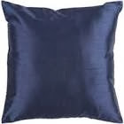
Next up is the "Throw Pillow" segment. I don't have too much to narrate here because I LOVE every one of these designs and colors. And being able to add accents like these below is the reason I wanted to anchor the room with a neutral pieces.

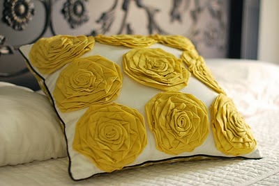 I adore the femininity that the yellow roses would add to the space without being overwhelming - being that I do share this room with a man. |
|


I'm not particularly married to the exact shades of blue, green and yellow that you see above but for now, they are what I have in mind. Below are possible side tables that I'd like to put in place of the glorified storage bins we're currently utilizing.


While I really enjoy the romantic feel of the 2nd bedside table, I fear it may be too feminine for hubby. The first table seems a bit more gender neutral and has that vintage charm that I love so much. Sidebar: I can't get enough of little charming vintage pieces.
So there you have it folks, my master bedroom ... at least how I see it when I close my eyes.
xoxo,
tanesia nerese
Love all your ideas. I cant wait to see it come together
ReplyDelete